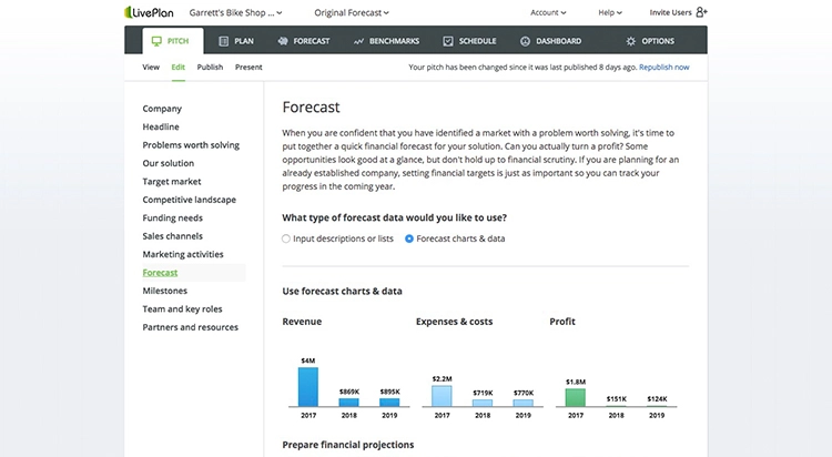
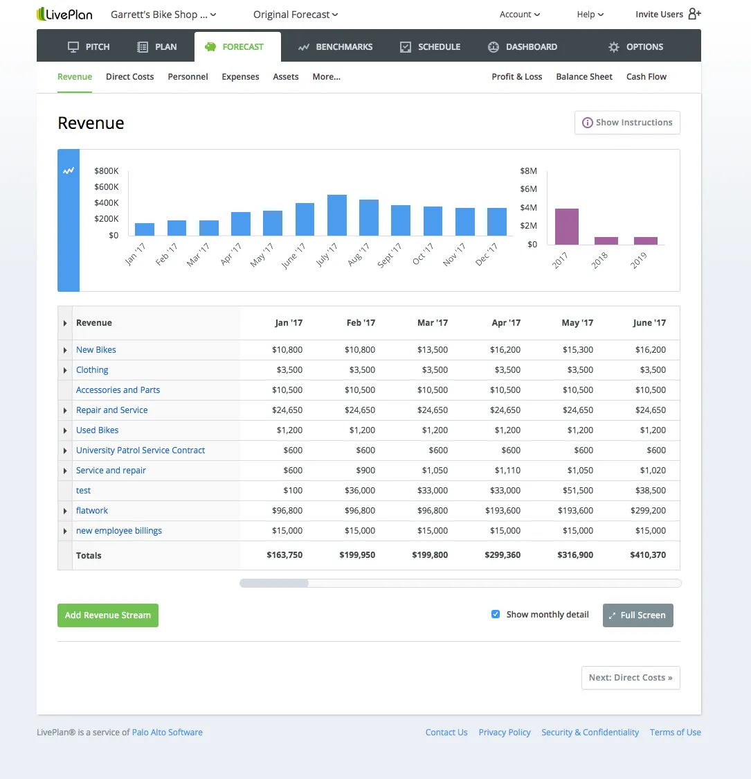
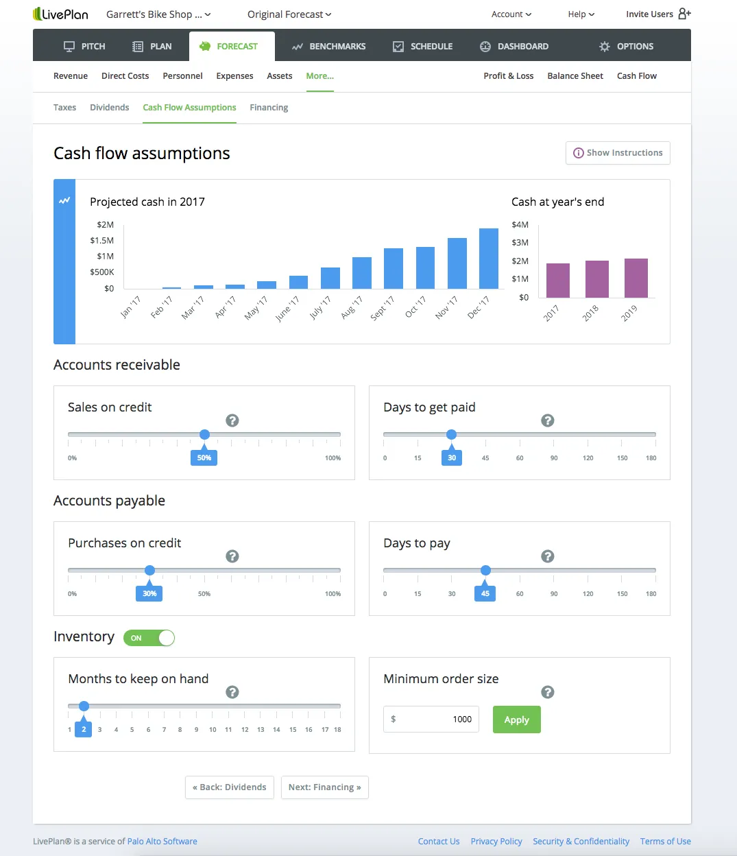
LivePlan started as a way for entrepreneurs to quickly create a business pitch. Over the years, the platform expanded — the ability to write a full business plan, develop financial forecasts, set milestones, compare performance against similar businesses.
Each new capability added value. Each also added interface complexity without a unifying design framework to hold it together.
By the time I joined the UX team, the application had accumulated layers of inconsistent interactions and controls.
Adding or removing content worked differently depending on which section the user was in. Visual hierarchy was inconsistent. The design itself hadn't been built responsively — it didn't work across devices.
And critically, the designers and developers weren't collaborating. Designs were handed over as static images, and what engineers built often drifted from the original intent because there was no shared system connecting them.
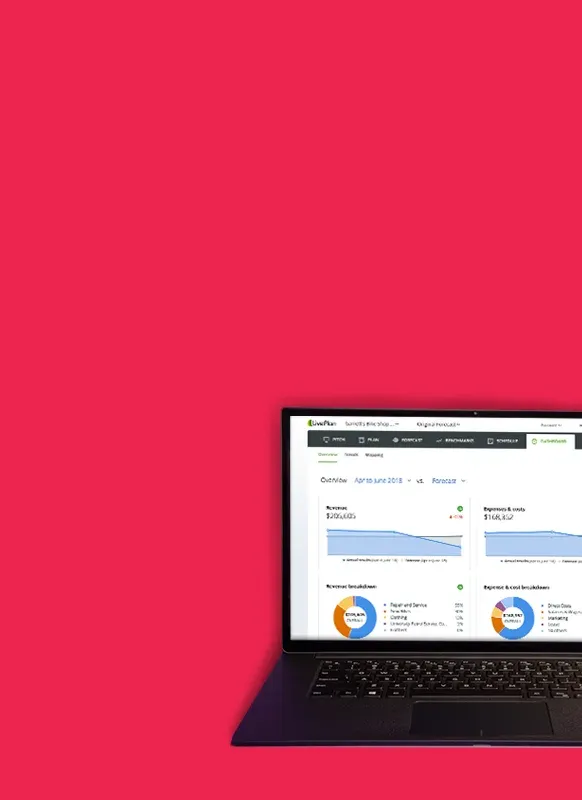
 After
After 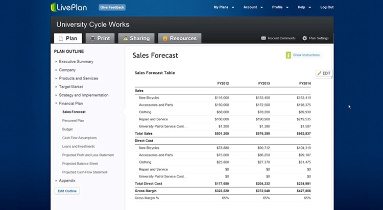 Before
 The company knew the application needed a redesign, and they hired an external UI designer based in Norway to create the visual direction.
He was talented, and his compositions were visually polished — but they were static Photoshop files that showed what screens could look like without addressing user workflows, interactive states, component behavior, or responsive breakpoints.
This was before tools like Figma existed. There was no design-to-code pipeline.
The development team had no way to faithfully implement what he designed.
And when a workflow wasn't covered by an existing comp — a frequent reality given the time zone gap and limited bandwidth — engineering was left making assumptions.
The redesign had to happen while the application continued serving its existing users.
The team was 16 to 22 people, and the external designer's availability was inconsistent. I couldn't pause development to wait for assets.
I needed to create a system that could absorb new designs as they arrived while also filling gaps independently — maintaining visual and interaction consistency whether the external designer had provided a comp or not.
Rather than treating my role as a pass-through — receiving designs, writing HTML and CSS, handing files to engineering — I recognized that the real gap was systemic.
There was no shared language between design and development. Static images couldn't communicate interaction behavior.
Developers couldn't ask the external designer quick questions because of the time zone difference. And the UX team needed to experiment with ideas faster than the external design workflow allowed.
I decided to build a component library. This wasn't just about speed. It was about creating a single source of truth that both designers and developers could reference, discuss, and build from.
That decision changed the dynamics of the entire redesign.
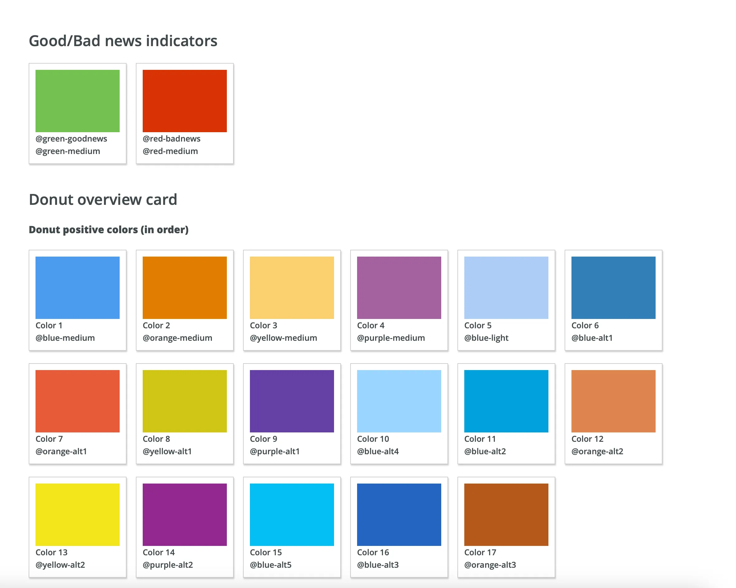
The component library wasn't a style guide sitting in a PDF somewhere. It was a living codebase — HTML and CSS built in a way that could be composed, reused, and iterated on.
Each component was pixel-perfect against the external designer's compositions, but it also encoded decisions that static images couldn't: responsive behavior, hover and focus states, spacing relationships, and how elements adapted when content changed.
When the designer delivered a new screen, I could break it into components, build what was new, and assemble the rest from existing parts.
More importantly, when a workflow needed a UI treatment not yet covered by the external designs, I could create it from the established system. The components carried enough design DNA that new compositions stayed visually and behaviorally consistent without requiring additional rounds with the external designer.
I organized and maintained a directory of components and prototypes so anyone on the team — designers, developers, product managers — could find, reference, and discuss any screen or interaction.
I started building the library in plain HTML and CSS — the fastest way to get working prototypes in front of the team.
As the library scaled, I migrated it to Mixture, a static site generator, and adopted Liquid as the template language. That shift meant components could be defined once and included across prototypes rather than duplicated, which made the system dramatically easier to maintain.
I managed version control through GitHub and SourceTree, giving the team a shared history of every change and a way to pull the latest prototypes at any time.
Over 14 months, the library grew to support more than 300 prototypes.
The prototyping system became the connective tissue between design intent and engineering output.
When a developer needed to build a feature, they didn't interpret a flat image — they opened a working prototype that showed exactly how the component should behave, what it looked like at different viewport sizes, and how it related to adjacent elements.
This eliminated an entire category of implementation drift. Features shipped looking and behaving the way they were designed because the reference material was already in code.
When the UX team wanted to experiment with a new approach — testing a different layout for the financial dashboard, exploring an alternative navigation pattern — they came to me.
I could mock up functional prototypes from existing components faster than the external designer could produce a static comp.
That speed gave the team room to iterate, test ideas, and make decisions based on working interfaces rather than wireframes.
When I started at Palo Alto Software, designers and developers operated in separate worlds.
Designers produced artifacts. Developers interpreted them.
The two groups didn't collaborate on implementation, and the resulting product showed it — inconsistencies between what was designed and what was built, repeated patterns that looked slightly different across sections, interactions that worked in one context but not another.
I was part of the UX team, but I wrote front-end code. That positioning — one foot in design, one foot in development — meant I could do something neither side could do alone: translate design decisions into technical specifications in real time, and translate technical constraints back into design adaptations before they became problems.
I made a deliberate effort to build relationships with the engineering team. I learned how they worked, what information they needed, and where handoff typically broke down.
Then I structured my prototypes and component documentation to address those specific friction points.
This wasn't a formal process change or a mandated workflow. It was relational — showing up, being useful, and gradually creating a collaboration pattern that hadn't existed before.
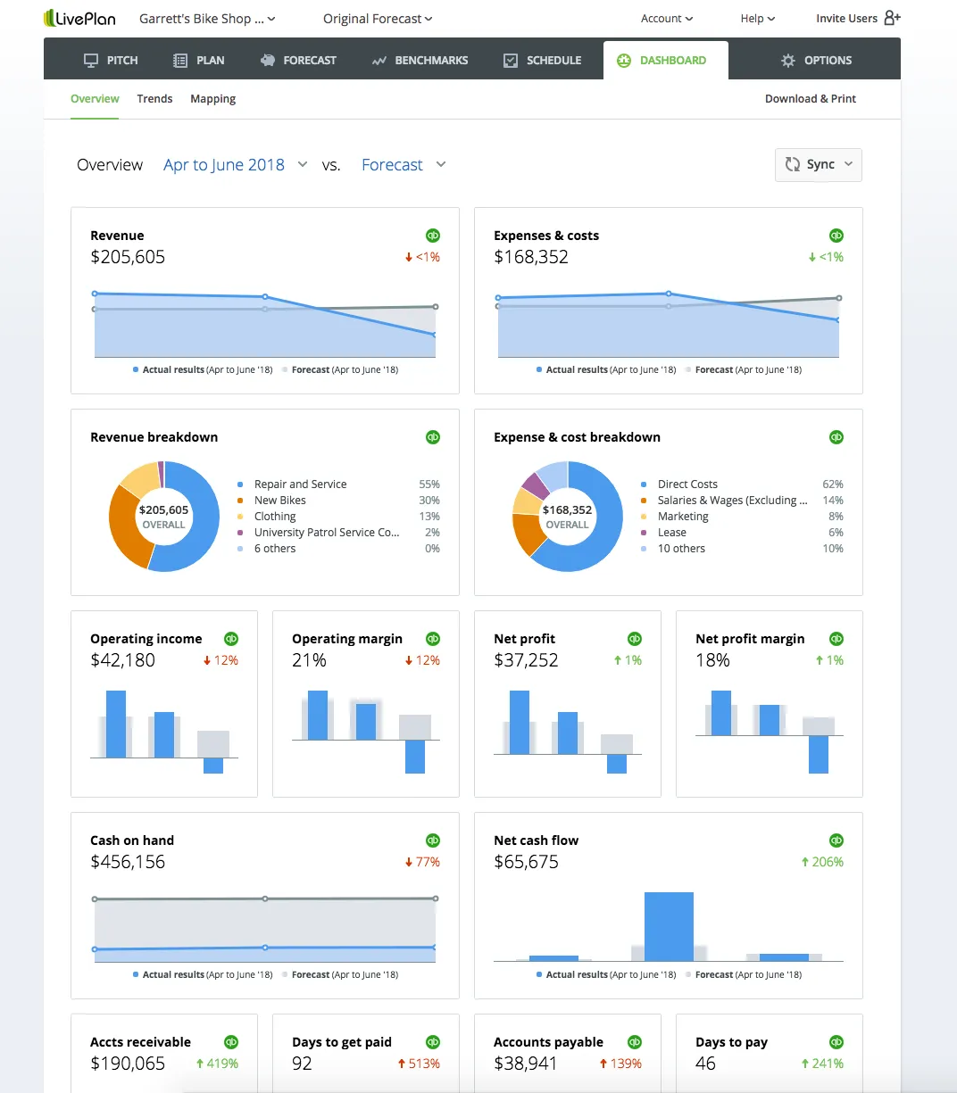
LivePlan grew to over 1 million users — and the redesigned interface supported that growth with a consistent, responsive experience across the platform's expanding feature set.
PC Magazine named LivePlan the #1 business planning software (Editors' Choice), and Forbes rated it 4.8 stars for financial forecasting. The application was endorsed by Bloomberg Businessweek, The Wall Street Journal, Stanford University, Entrepreneur magazine, and others.
The component library became the team's design-to-development pipeline — over 300 prototypes maintained in a shared system that eliminated guesswork from implementation and gave the UX team the ability to experiment and iterate at the speed of code.
If I were to do this project again, I'd push earlier to formalize the component library into a documented design system with explicit naming conventions, versioning, and contribution guidelines.
The library worked well because I maintained it — but that's a single point of failure. A more structured system would have survived beyond any one person's involvement and scaled more easily as the team grew.
I'd also advocate for bringing the external designer into the prototyping workflow rather than treating design and code as sequential steps.
Seeing components in a browser — responsive, interactive, real — changes how a designer thinks about their work. That feedback loop would have caught workflow gaps earlier and reduced the number of times I needed to design solutions independently. ▪️
All work © Jayna Bergerson unless otherwise noted.