Imagine you manage health risk for a corporation with employees across multiple regions.
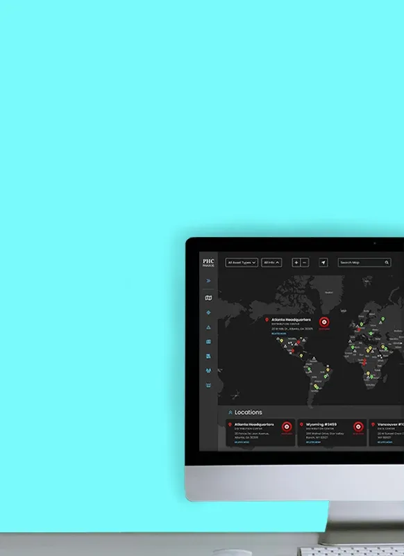
You open Pharos — a threat-tracking platform — and see a dashboard of global health events.
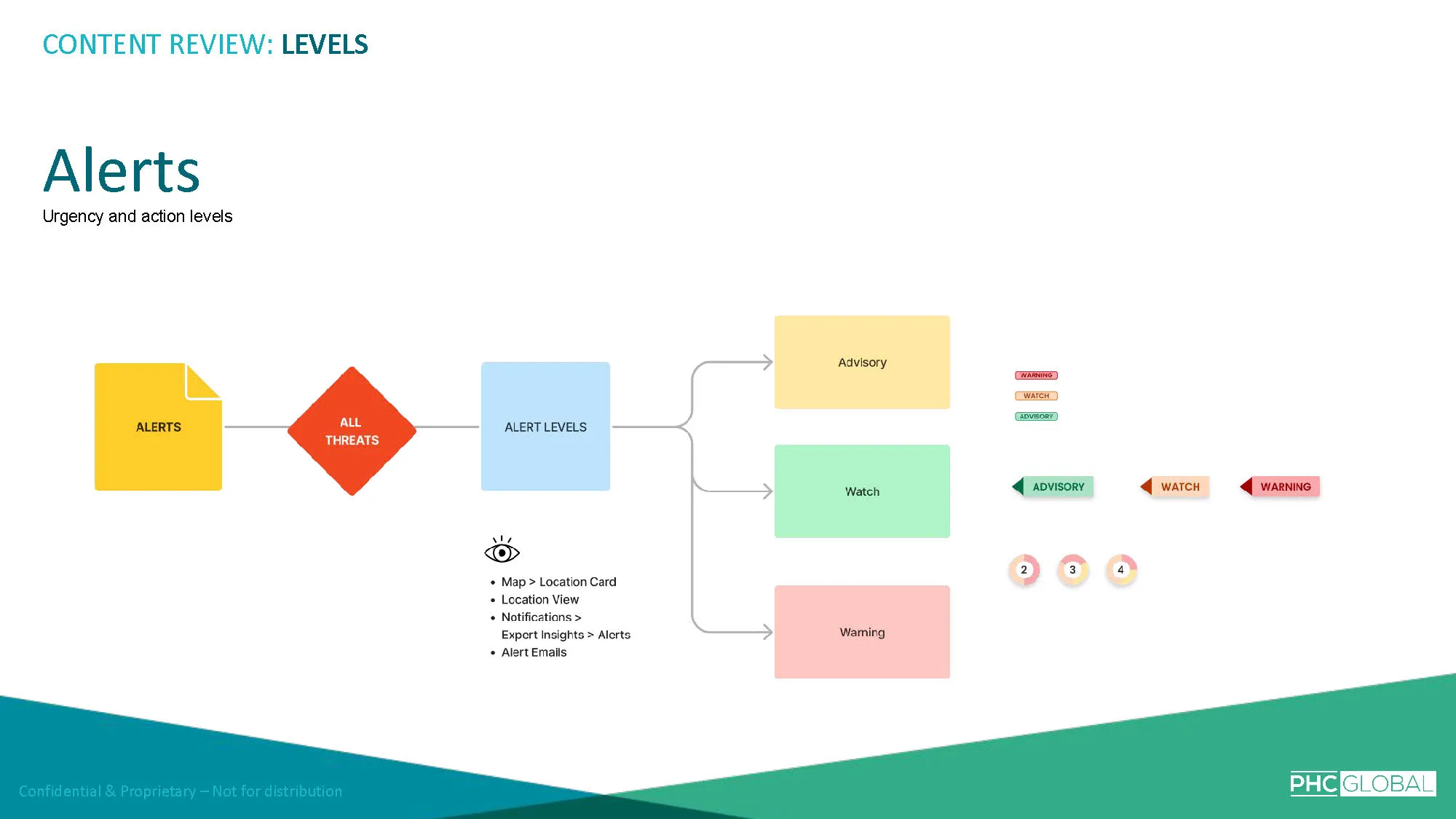
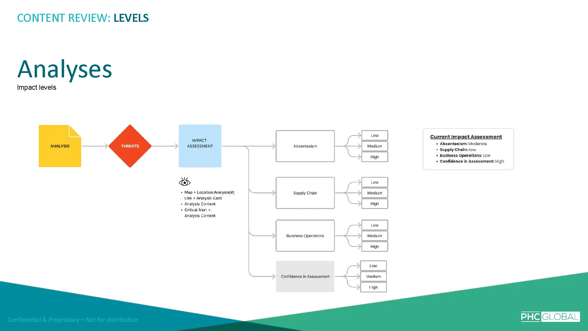
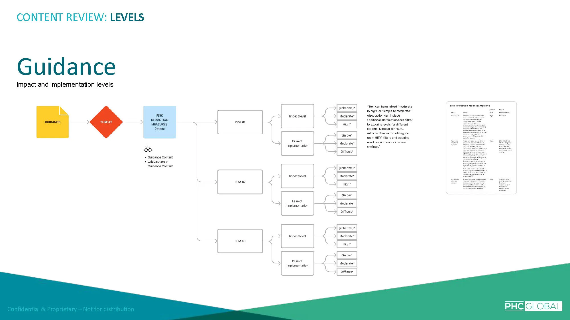
Some have urgency icons. Some have trend indicators. Some have confidence levels.
There are multiple layers of signals, each using different visual systems, and you're expected to synthesize all of them to determine which threats actually matter to your organization.
You can't. Not quickly, anyway.
The platform has too many urgency levels, too many icons — some doing the same thing, others doing multiple things — and too many confidence indicators that require you to figure out what they mean and how they apply.
The data is thorough. The science is credible.
But the interface asks users to do the work that the design should be doing for them.
Pharos was born out of the urgency of COVID-19 — the idea that organizations needed real-time visibility into outbreaks and biological threats in their operating regions.
PHC Global had built a platform backed by medical scientists, and the data pipeline was solid.
But the layer between the data and the user — the content strategy, the information hierarchy, the visual prioritization system — was working against itself.
The platform had grown complex as each new feature introduced its own data indexes, design patterns, and visual indicators — layers that hadn't yet been reconciled into a unified experience.
Helpful content was buried or disconnected from related content types. Threats were not always easy to identify; many required reading body text to find.

And critically, threats were not prioritized for the user based on their own settings or selections.
The result was an expert-level data environment that demanded expert-level interpretation — which was exactly the opposite of what users needed.
A corporate health risk manager doesn't need to understand the epidemiological nuance behind every data point.
They need to know: Is this critical? Do I need to act?
Everything else should be available if they choose to dig deeper, but the surface layer needs to give them the answer immediately.
The platform had been designed by and for scientists.
The people creating the content understood every nuance of every indicator. They struggled to see the problem because the complexity was transparent to them — they'd built it.
Helping stakeholders see that their detailed, scientifically rigorous interface was inadvertently increasing cognitive load for non-expert users required showing them the experience through the user's eyes rather than the expert's.
The team was small — six people — and the engagement was five months.
I needed to diagnose the content strategy problems, develop recommendations, design solutions, and present them persuasively to stakeholders who were deeply invested in the existing approach.
Rather than starting with the visual design, I started with the content.
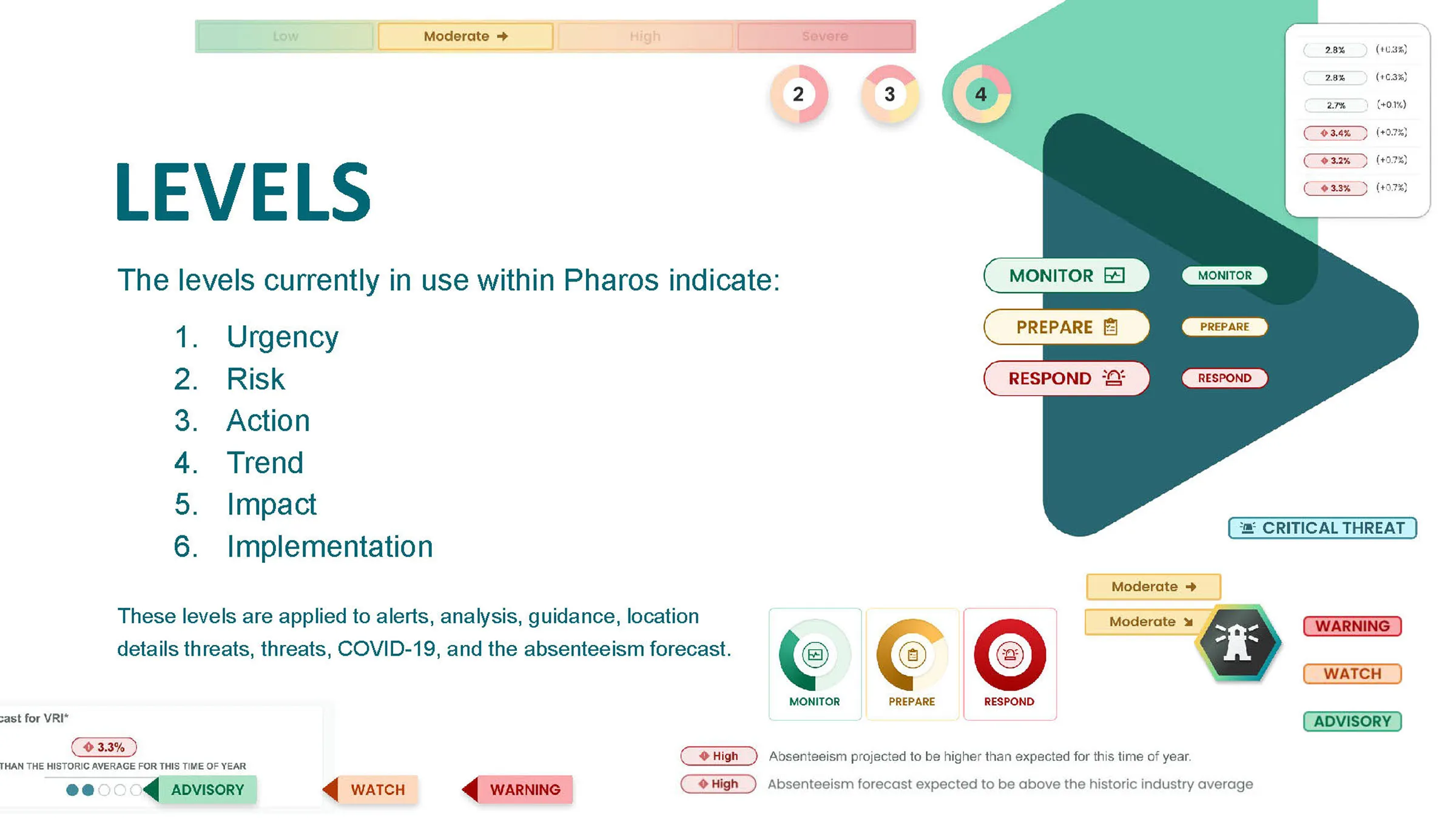
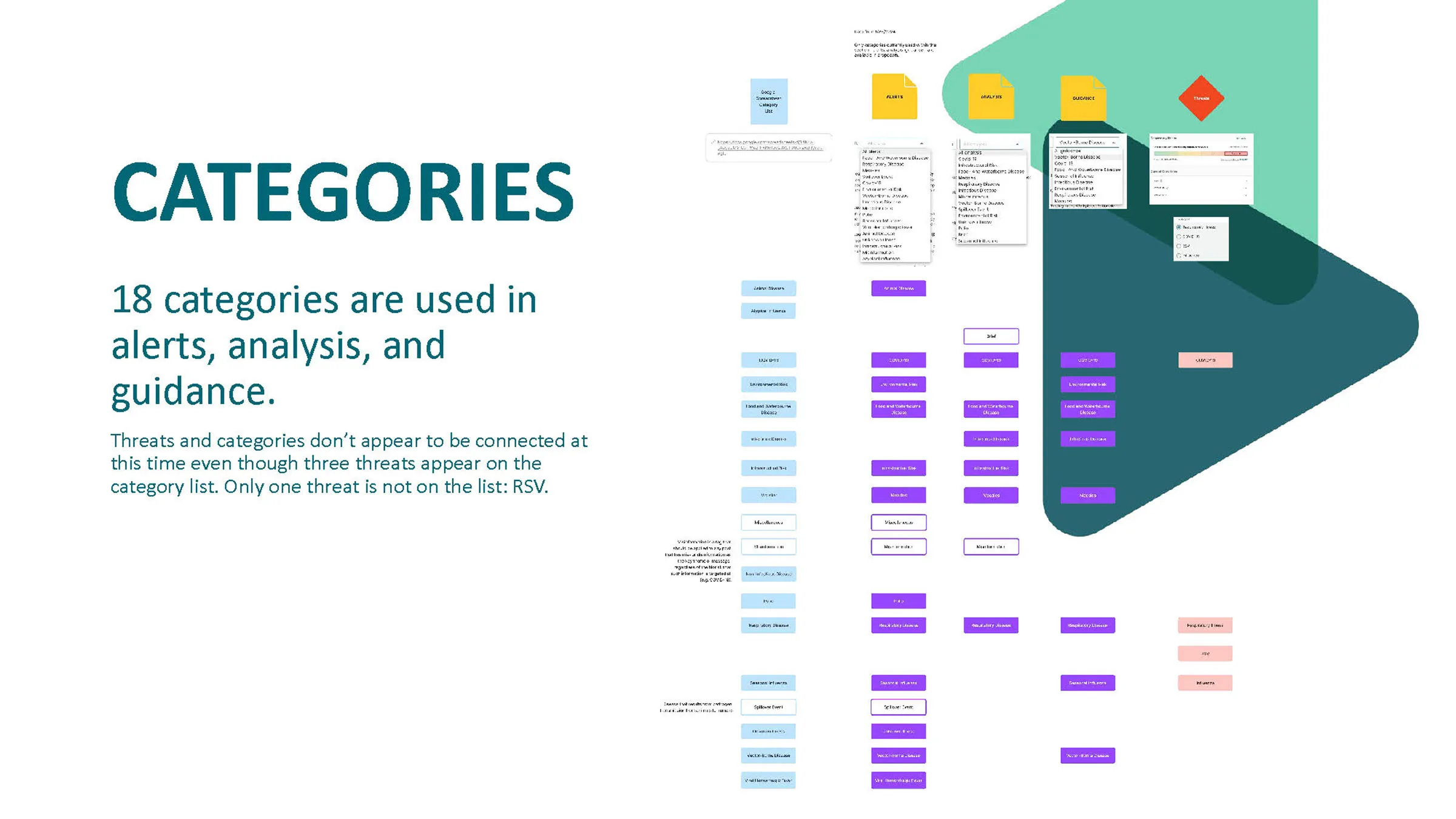
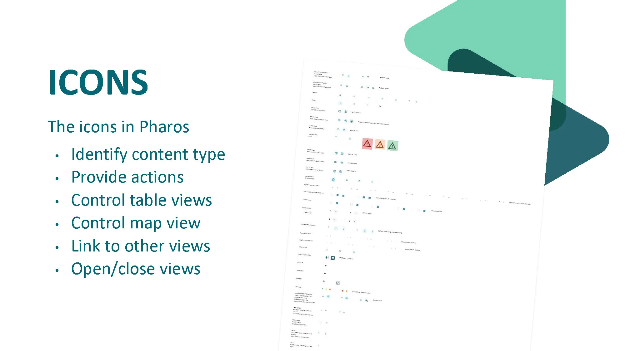
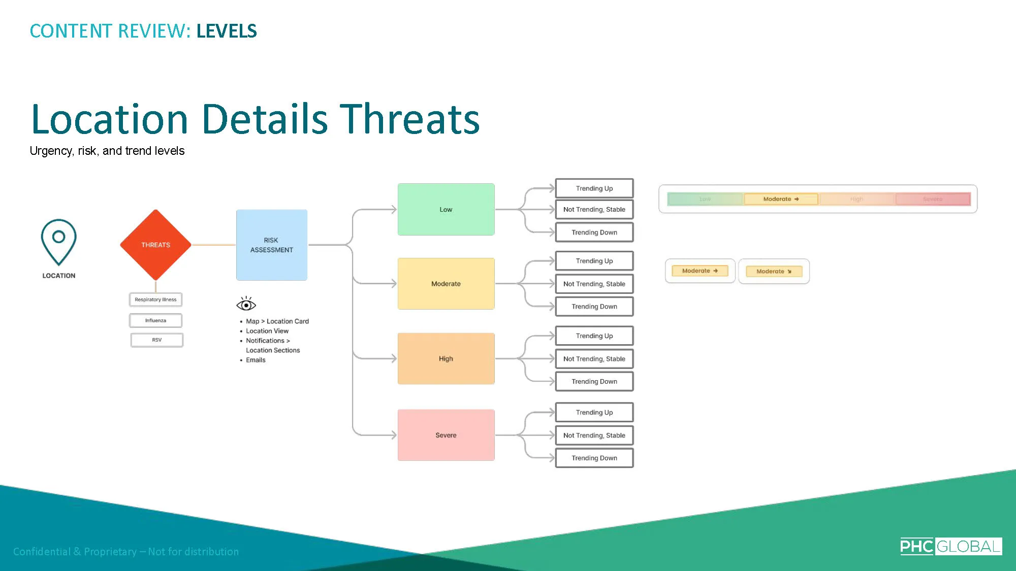
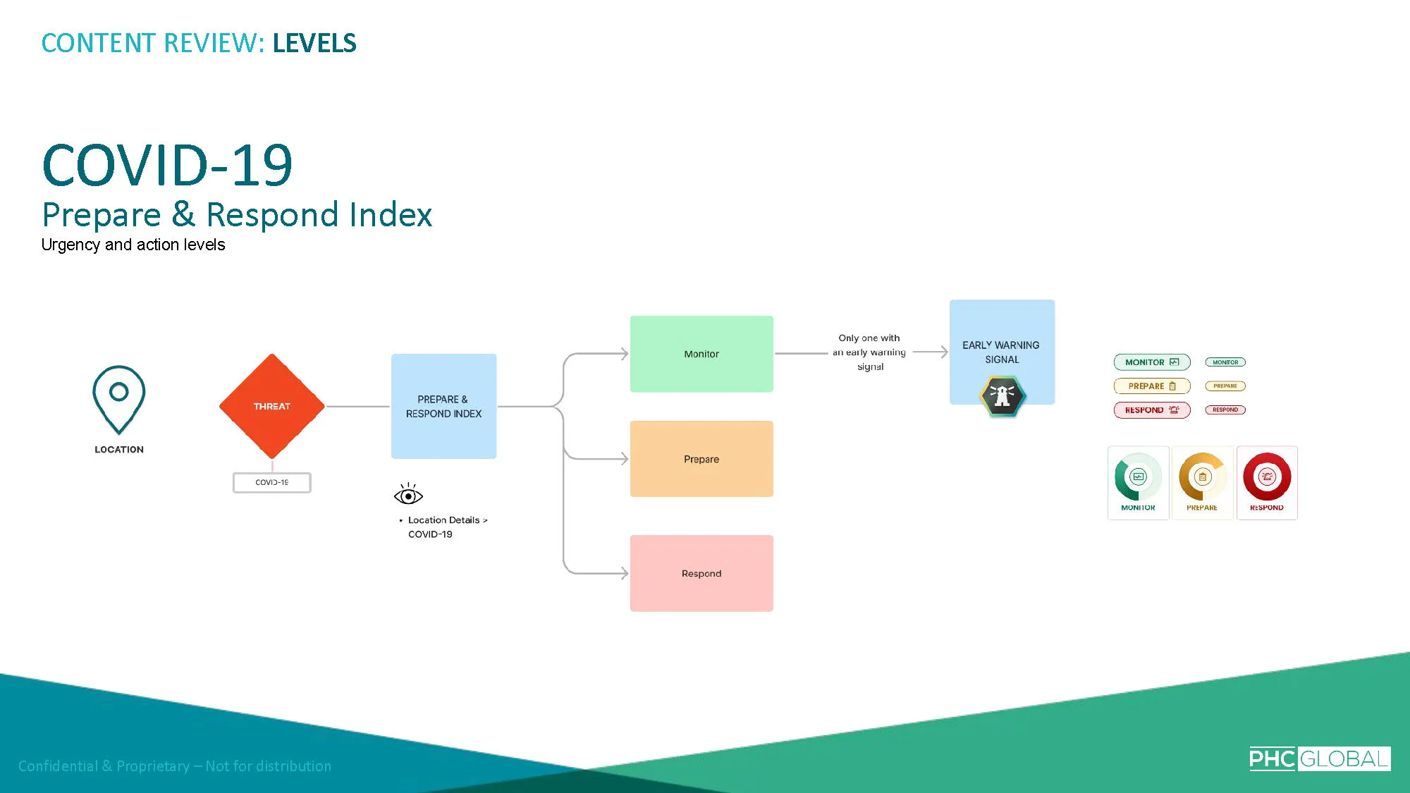
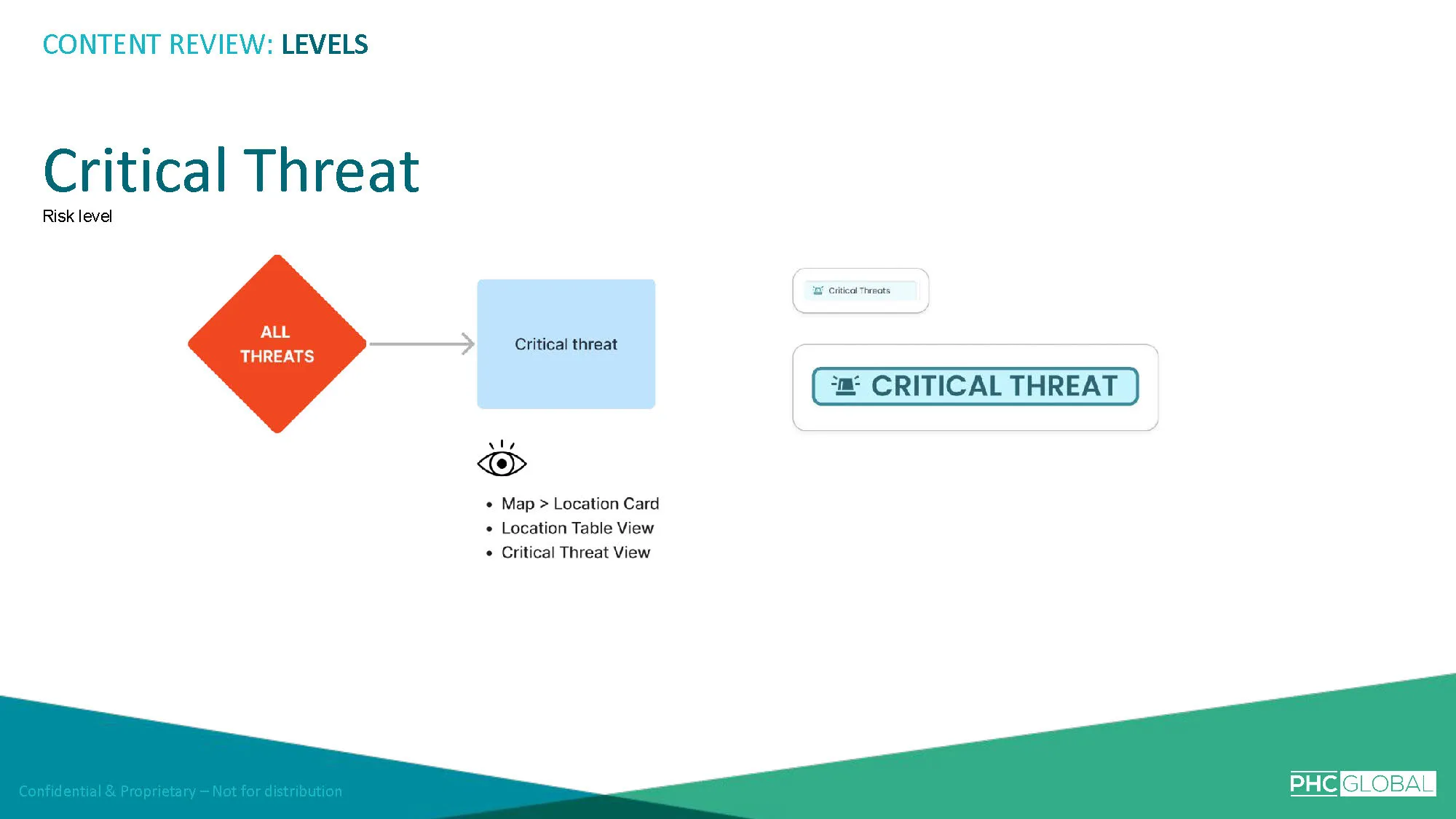
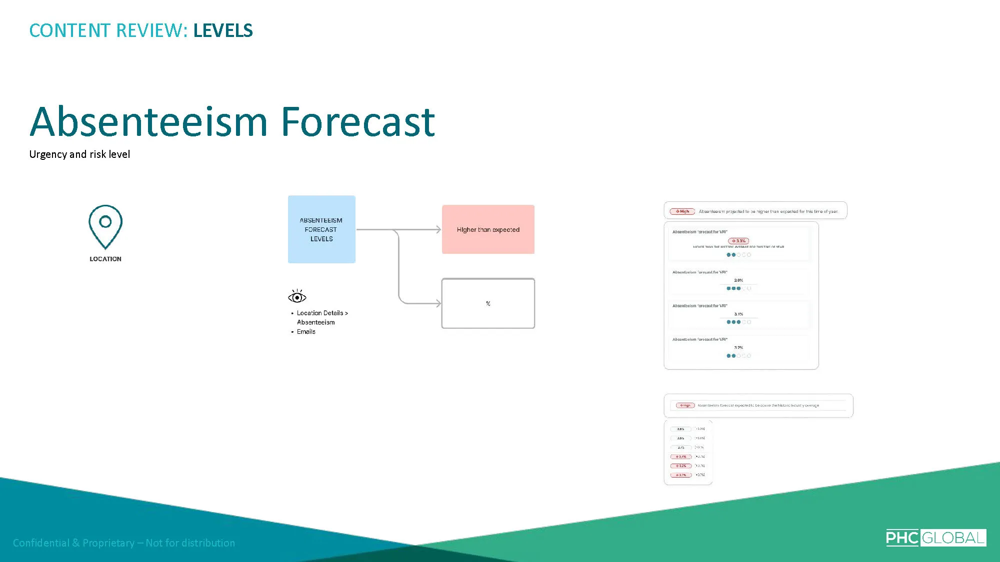
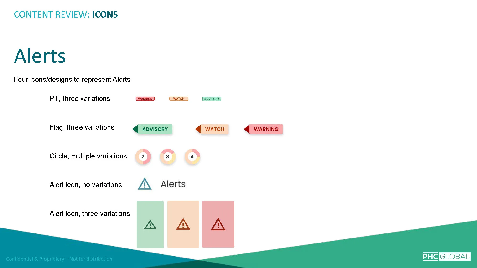
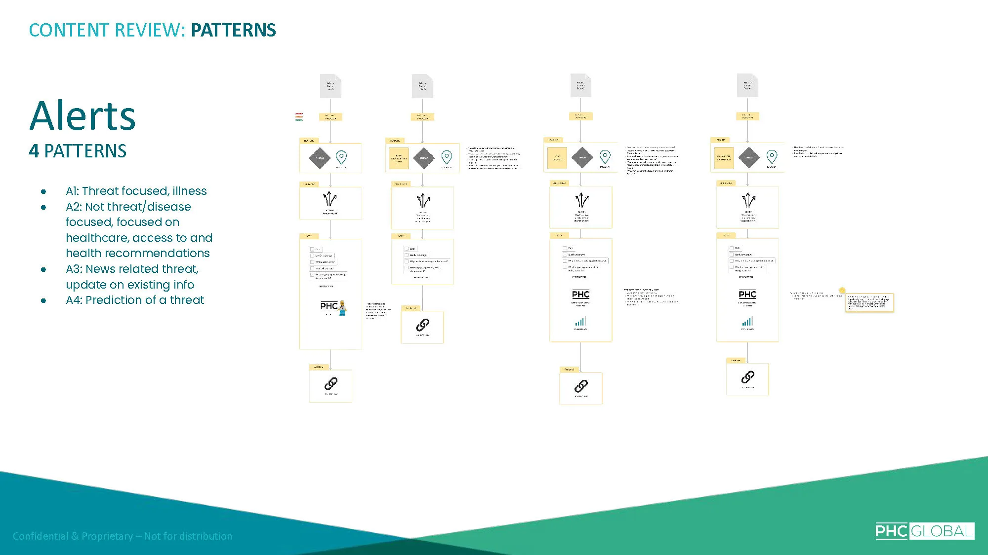
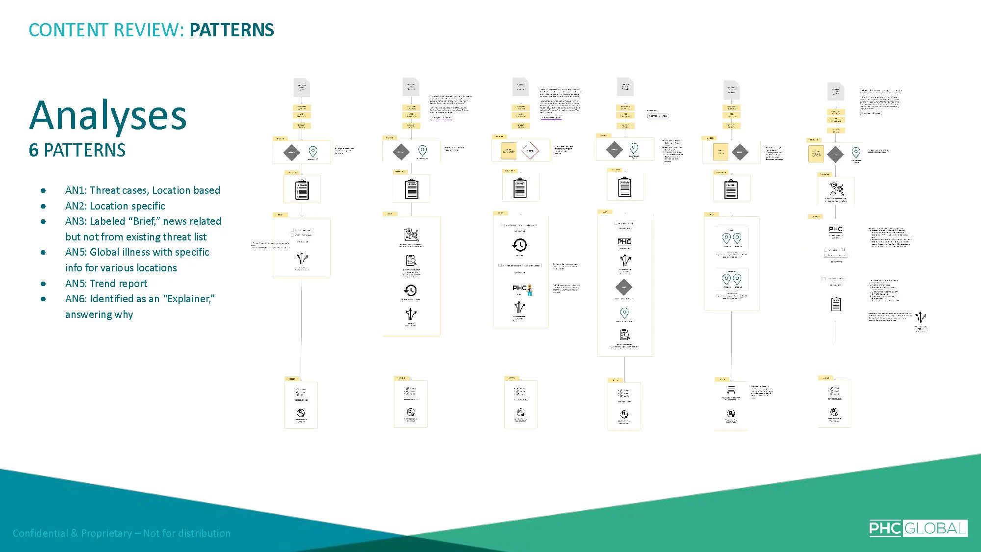
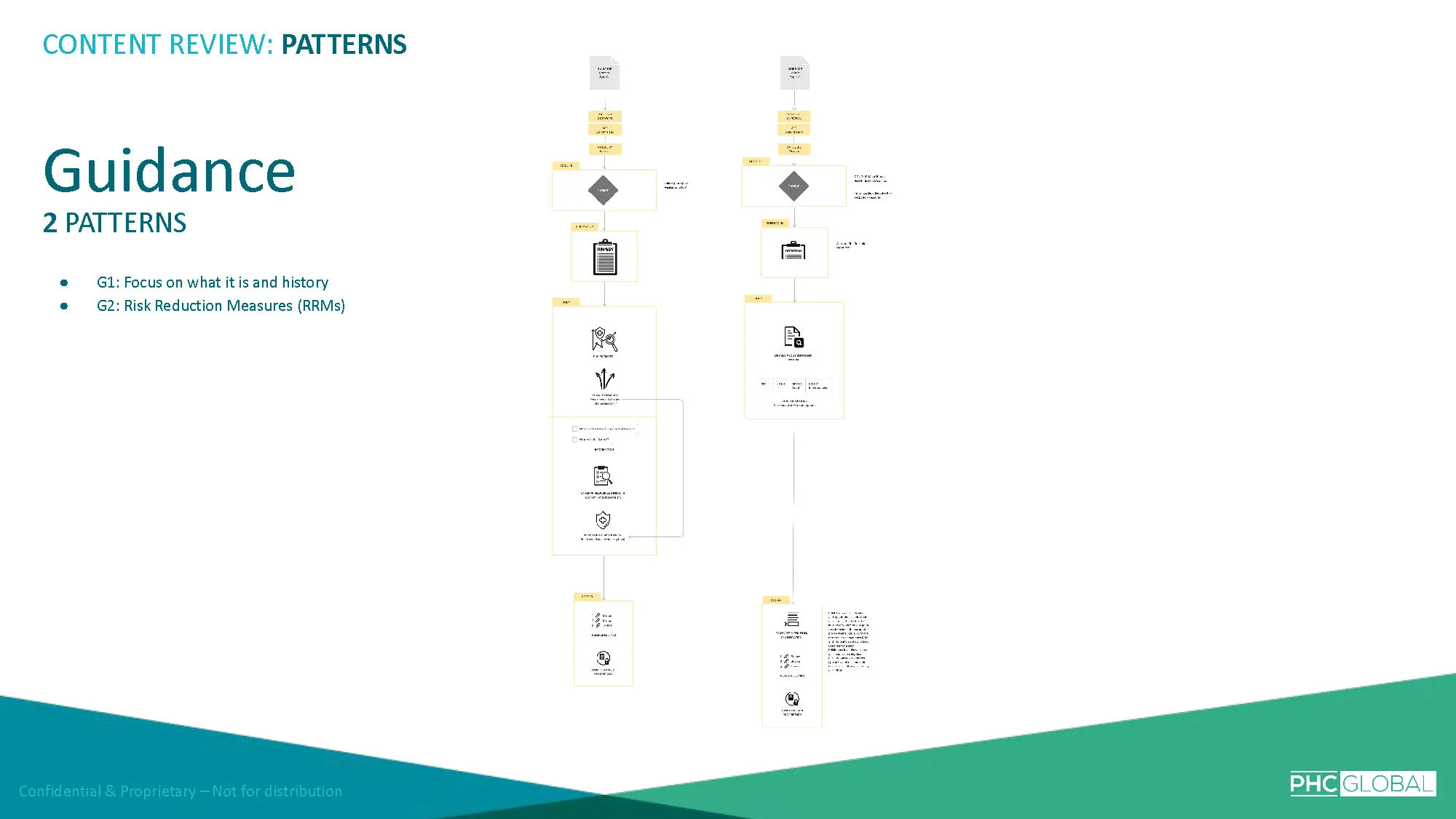
I charted every content pattern and type across the platform — urgency levels, threat levels, action levels, trend indicators, confidence signals.
I mapped how users were expected to move through this information and where the experience broke down.
What the charting revealed was that the problem wasn't insufficient data — it was that the data had no hierarchy.
Everything was presented at the same level of emphasis. Users had no way to scan, filter, or prioritize without reading deeply into each item.
The icons that were supposed to provide quick visual signals had become a language of their own — one that required as much cognitive effort to decode as the text they were meant to replace.
The content strategy insight reframed the entire engagement: this wasn't a redesign problem. It was a prioritization problem.
The solution wasn't about making the interface more attractive — it was about deciding what information belongs on the surface, what belongs one layer deeper, and what belongs further still.
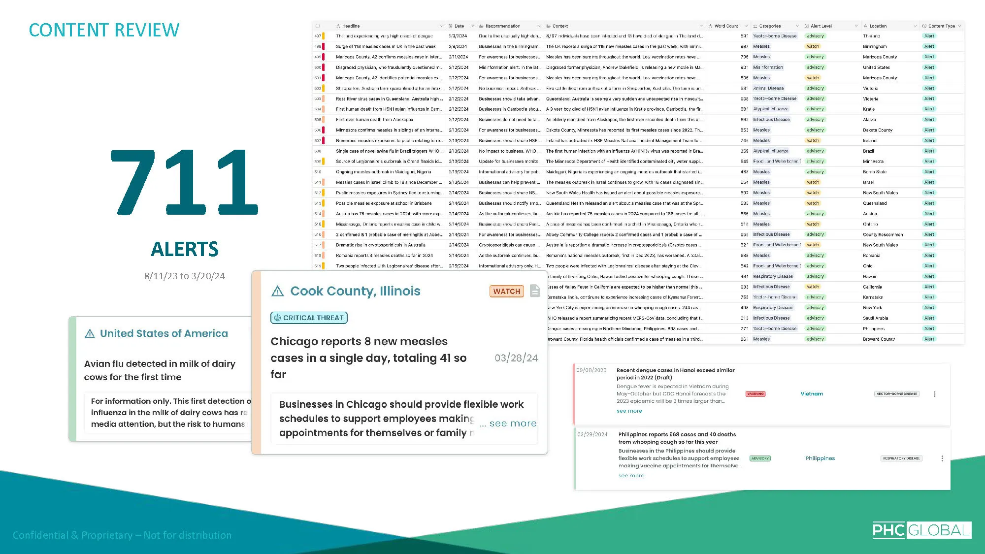
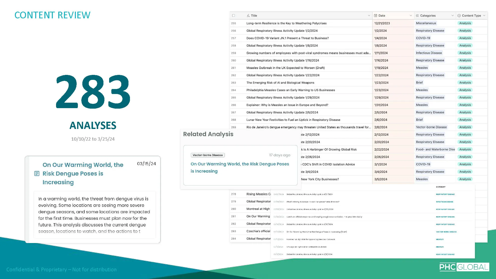
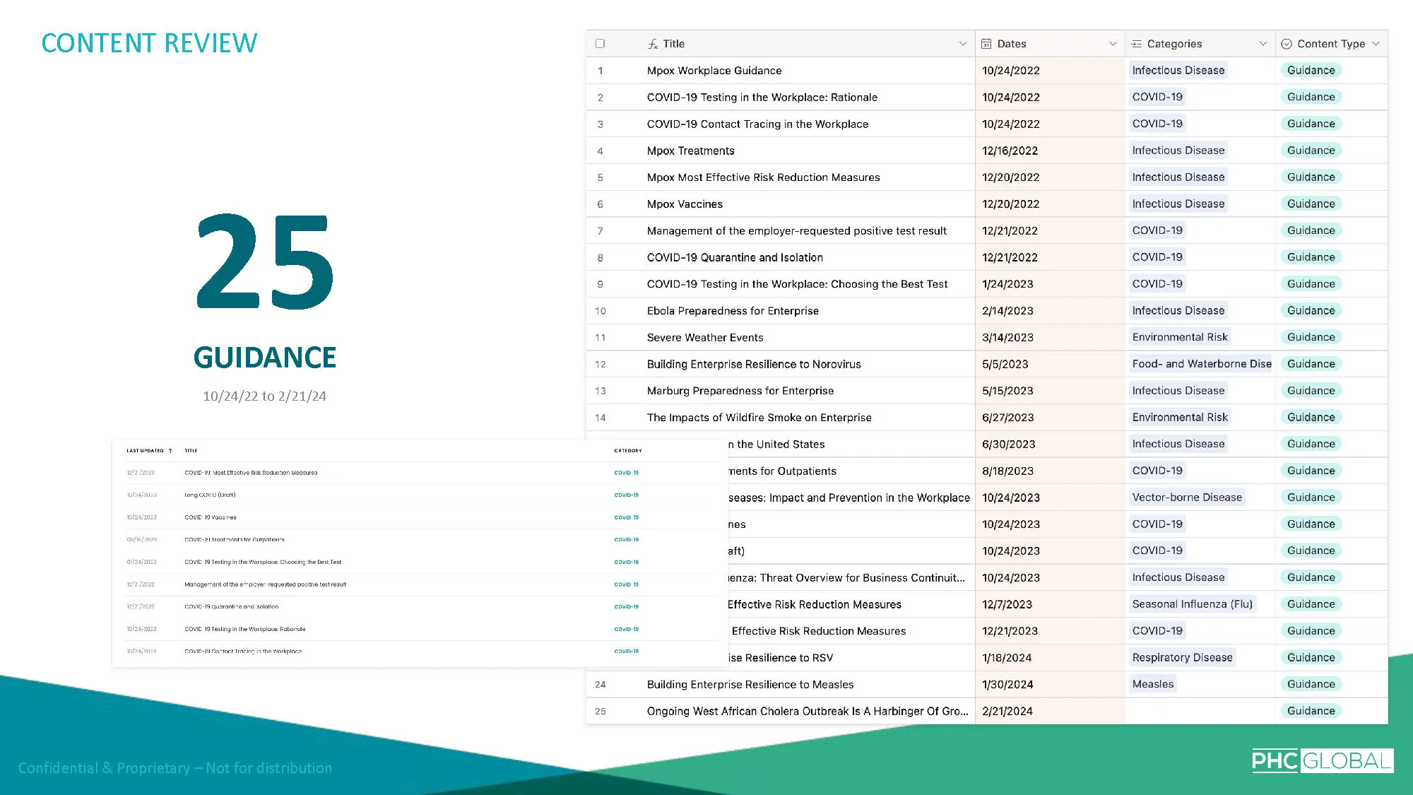
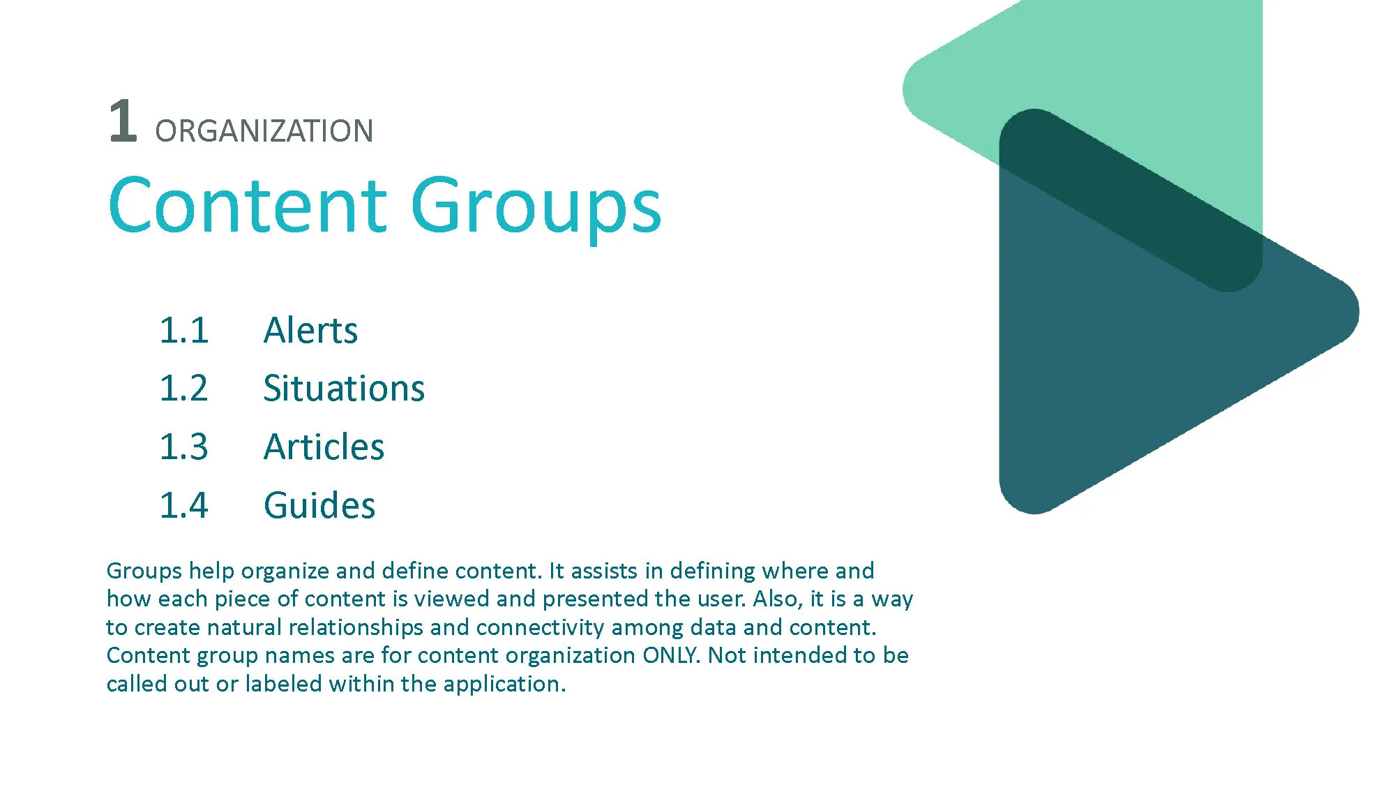
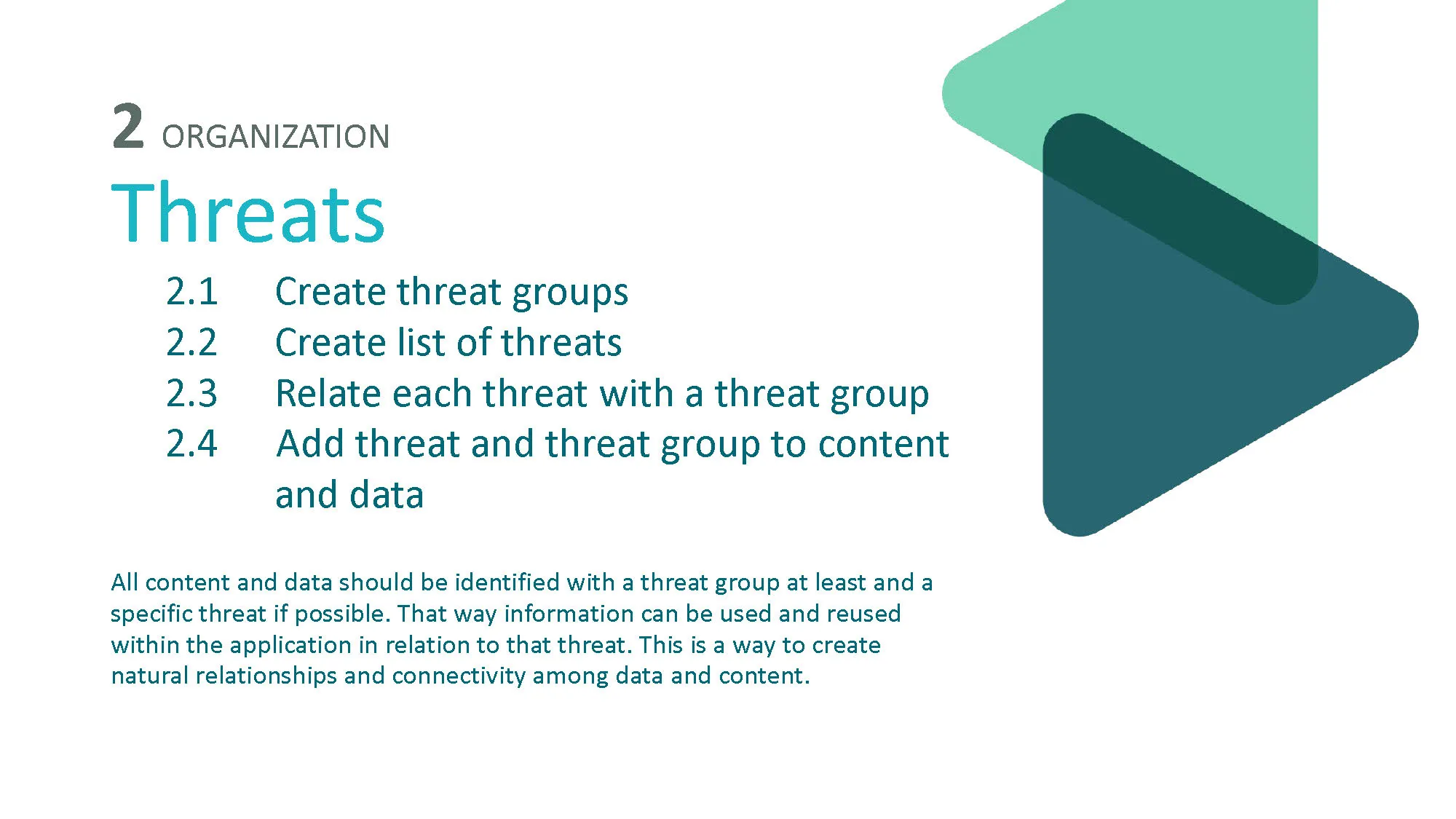
The first deliverable was a comprehensive map of the platform's content architecture — every content type, every urgency level, every icon, every indicator, documented and cross-referenced.
This wasn't an audit for audit's sake. It was the evidence I needed to show stakeholders where their own system was contradicting itself.
The mapping revealed patterns that weren't visible from inside the product.
Icons weren't consistent — some urgency icons appeared in contexts where they signaled something different than they signaled elsewhere. Some had been repurposed as features were added.
Confidence indicators used different scales in different parts of the platform.
Urgency levels had multiplied to the point where the distinctions between them were so granular that users couldn't meaningfully act on the differences.
I used this mapping to prioritize the challenges.
Existing user research already confirmed the confusion — what I needed was to explain why and present a path forward that resolved it without discarding the scientific rigor that gave the platform its credibility.
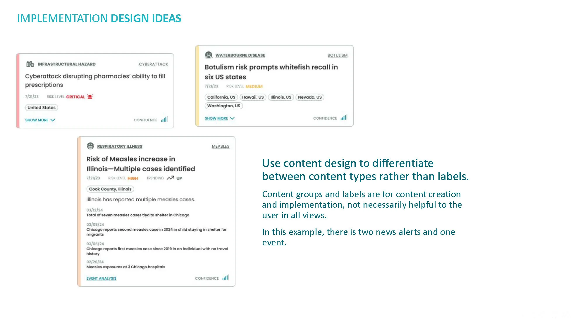
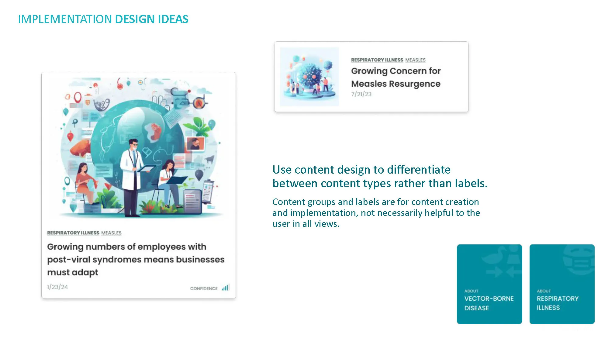
I organized the 20 recommendations not as a flat list of fixes but as a coherent strategy.
Each recommendation connected to a specific challenge identified in the content analysis, supported by evidence from the user research, and accompanied by a design concept showing what the recommendation would look like when implemented.
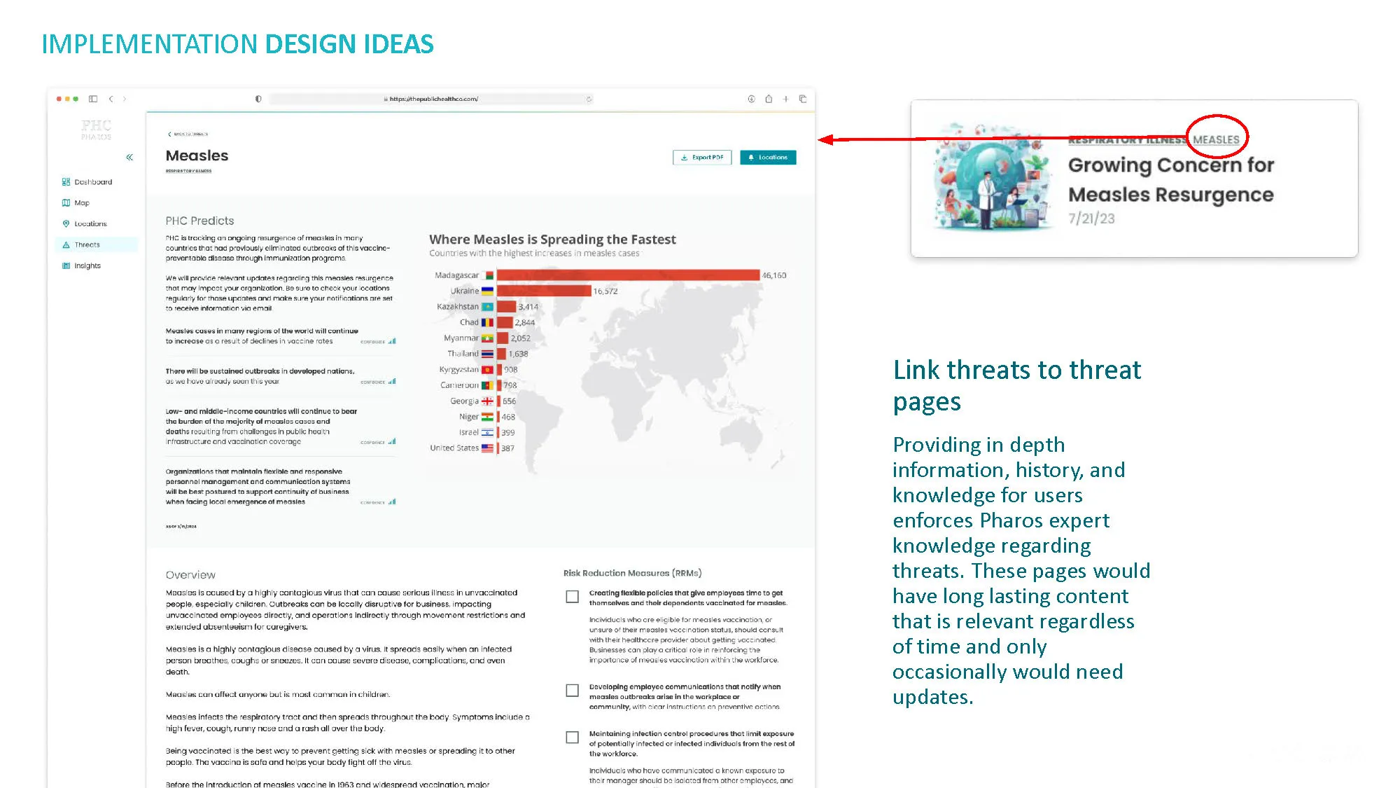
The core principle was progressive disclosure: give users the critical signal first — Is this threat relevant to me? Is it escalating? — and make the scientific detail available on demand rather than required for comprehension.
The notification system, for example, was sending too much information in the initial alert. Users were receiving the full complexity of a threat at first contact — the email notification — which was exactly the wrong place for that level of detail.
The notification should create awareness and urgency. The platform should provide depth.
 After
After 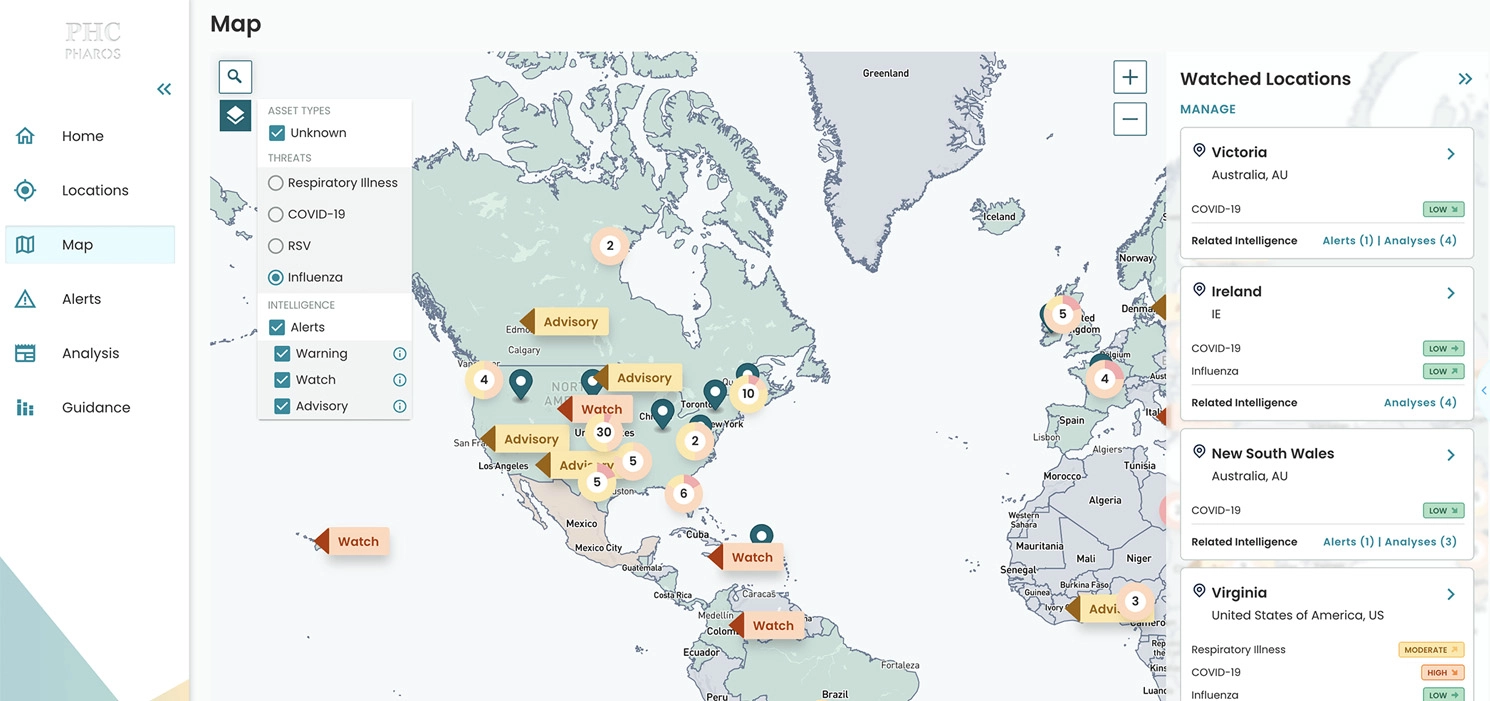 Before
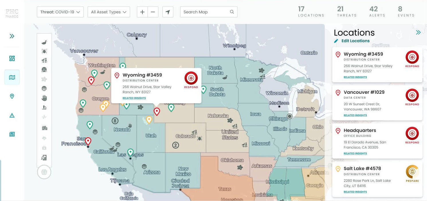
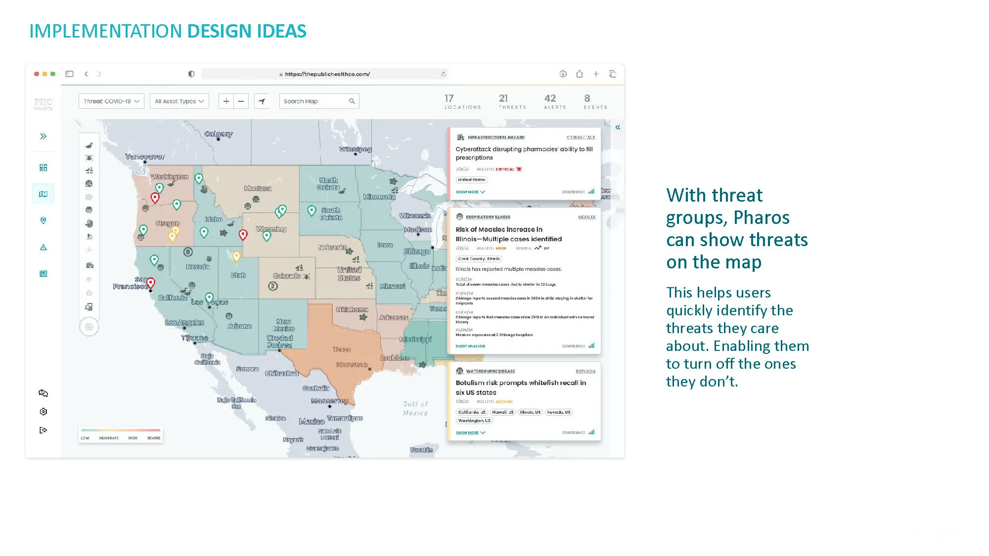
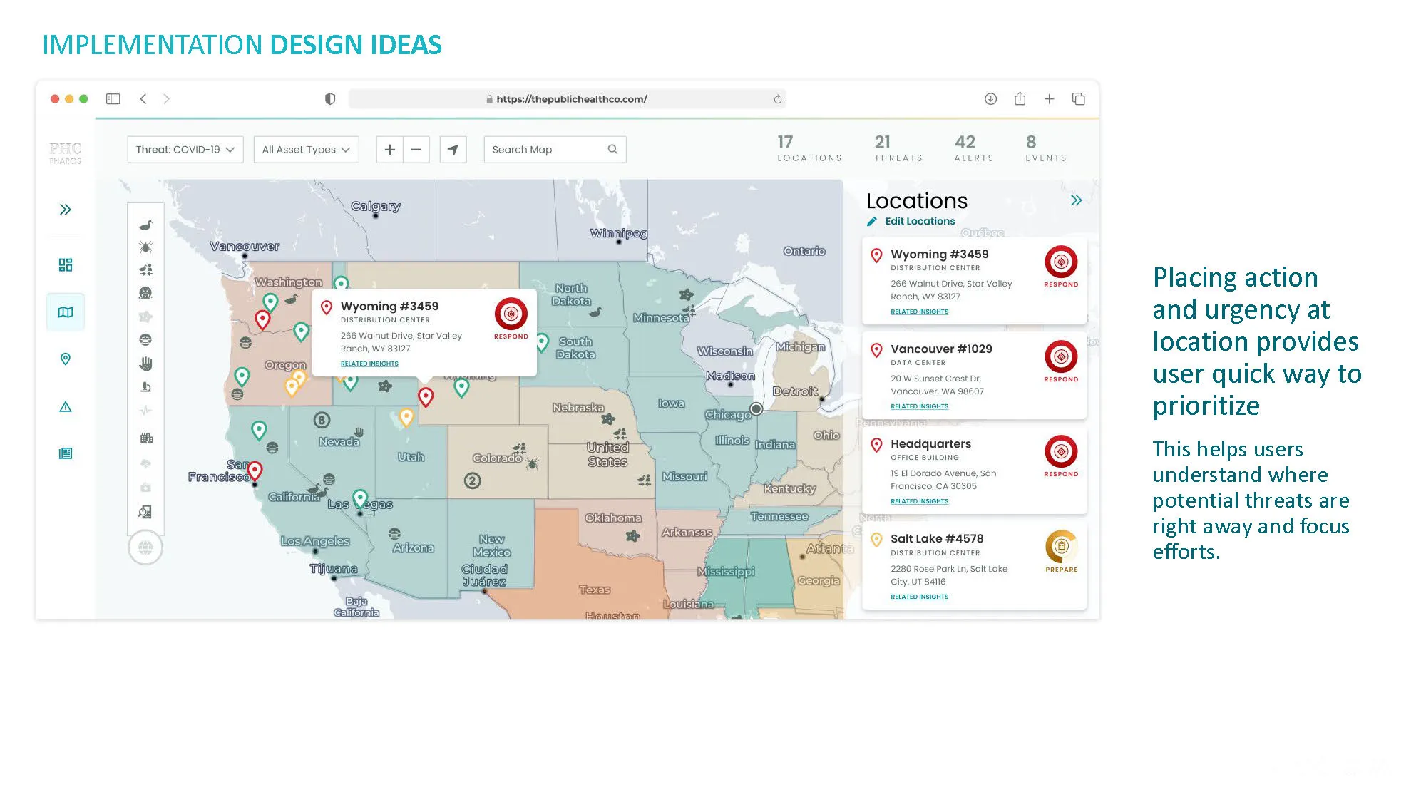
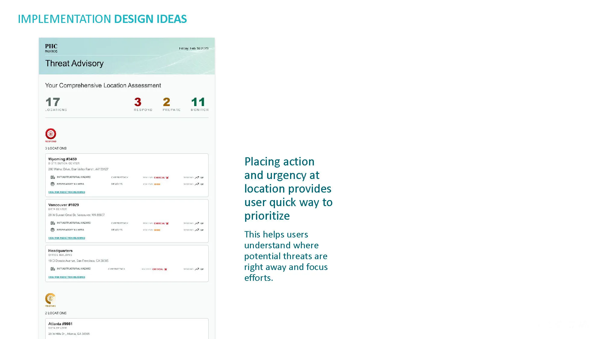
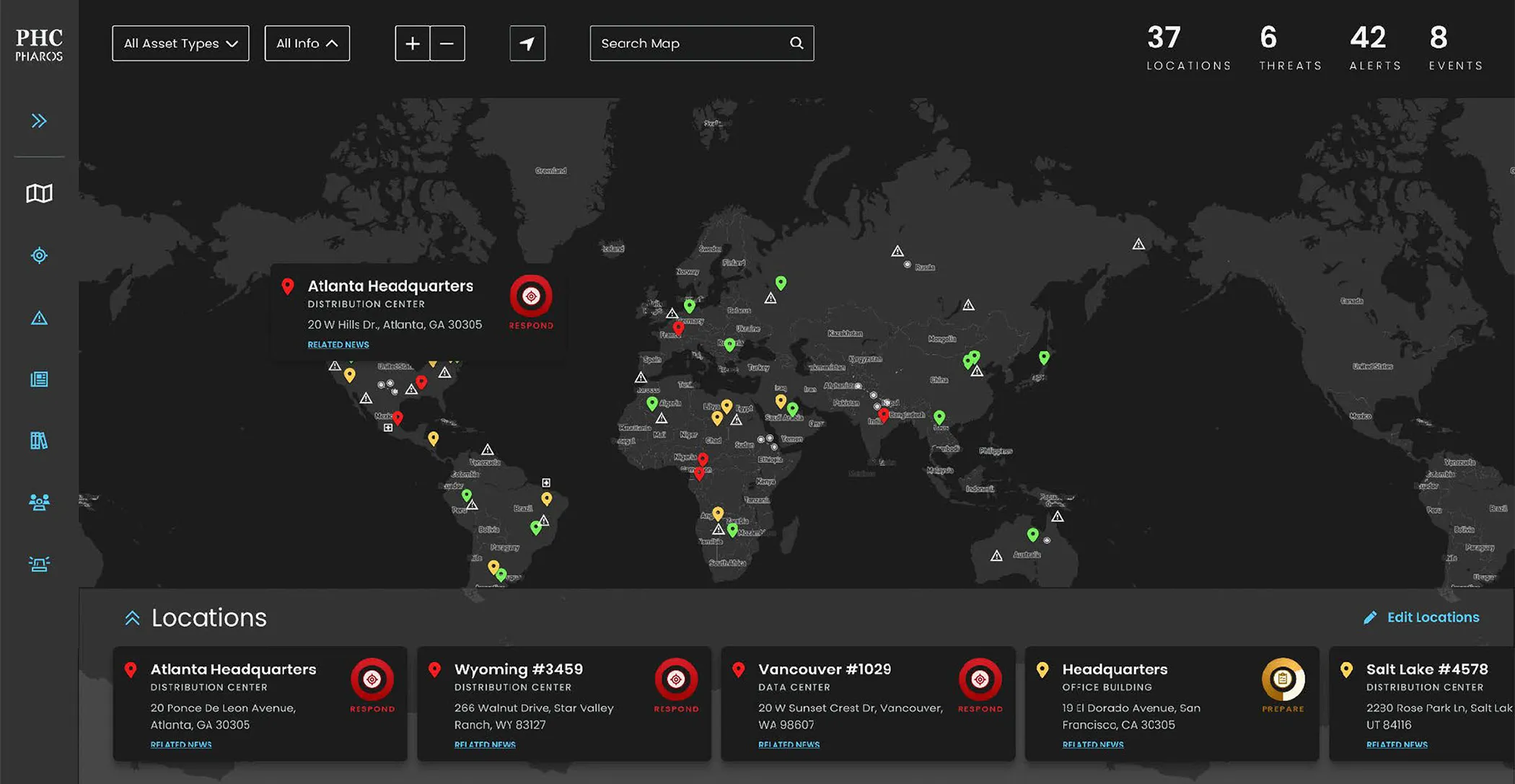
 The centerpiece of the implementation designs was a redesigned global threat tracker that reorganized how users interacted with threat data.
The existing tracker presented threats as a flat list with multiple overlapping indicators.
The redesign introduced a prioritization layer — allowing users to configure their own relevance settings and see threats filtered and ranked based on criteria that mattered to their organization.
This wasn't just a filter. It was a shift in the mental model.
Instead of presenting the universe of threats and asking users to find the ones that mattered, the redesign started from the user's context and surfaced what was relevant.
Users who needed to go deeper could — every data point, every confidence level, every trend indicator was still accessible.
But the default experience answered the question that brought them to the platform in the first place.
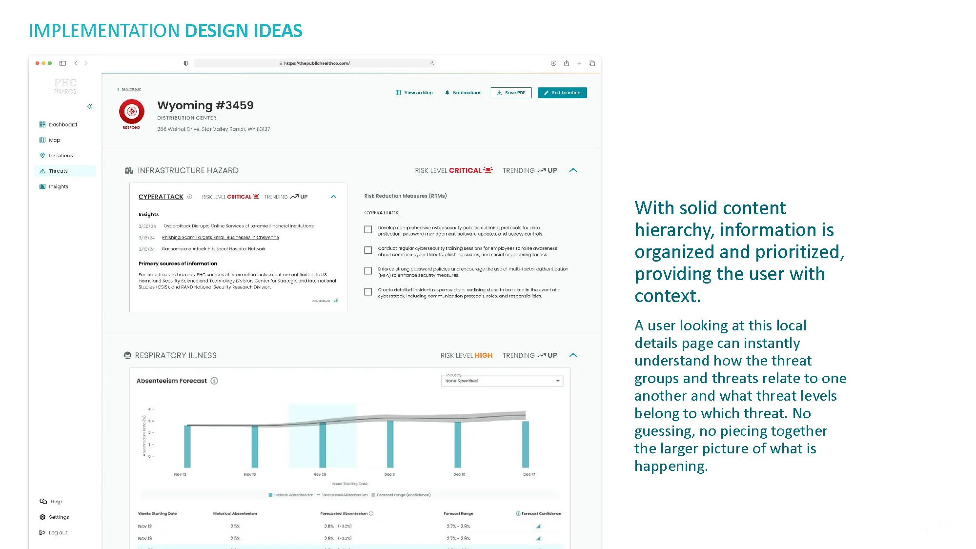
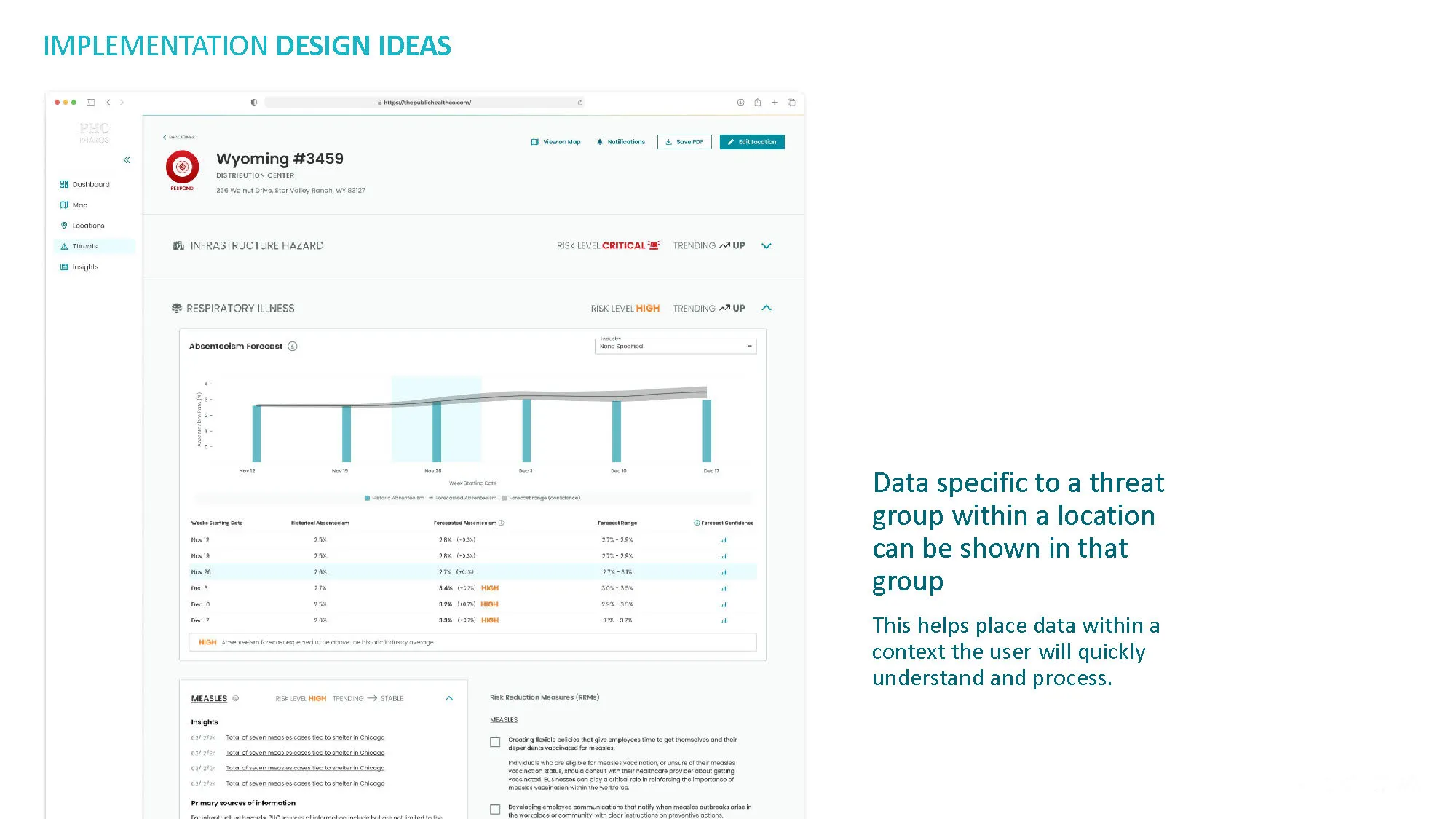
I designed implementation-ready screens showing how the recommendations would manifest across the platform — the tracker view, the threat detail view, the notification flow, the indicator system.
Each design was connected to specific recommendations from the strategy, creating a clear line from diagnosis to solution to buildable spec.
When presenting to stakeholders, I showed the existing experience alongside the proposed design — not as a critique, but as a progression. This is what you're asking users to parse today. This is what they would see instead.
The contrast was the argument. When you place a dashboard with seven competing indicator types next to one with a clear priority hierarchy, the case makes itself.
The stakeholders — scientists and founders who had built the platform's data infrastructure — responded to the evidence.
The content mapping gave the recommendations credibility because it was based on their own data, their own content patterns, their own system.
I wasn't imposing an external framework. I was showing them what their own platform was doing and what it could do instead.
20 UX/UI improvement recommendations and 17 implementation-ready designs were delivered — providing PHC with a comprehensive content strategy and design roadmap that addressed the fundamental prioritization gap in their platform.
PHC raised $35 million in Series A funding during the engagement period. While the funding reflected the company's broader trajectory and the market demand for public health intelligence tools, the UX/UI improvements and design direction contributed to the product's readiness for that level of investment and scrutiny.
The content strategy reframed how the team thought about their own product. The engagement shifted the internal conversation from "we need better design" to "we need better information hierarchy" — a distinction that would influence how new features were integrated rather than bolted on.
PHC Global was later awarded a $150,000 biosecurity contract as part of the Global Innovation Challenge, funded by the Defense Innovation Unit (DIU) within the U.S. Department of Defense.
I can't directly attribute the award to this engagement, since my contract was complete a couple of months before the challenge was awarded, but the recommendations were designed to strengthen the platform's usability and prioritization capabilities in ways that likely supported its readiness for high-stakes national security applications.
Also, I provided a design specifically for the contract proposal — a concept for how the platform could be adapted to meet the unique needs of biosecurity monitoring — which may have contributed to the proposal's strength.
If I were to do this engagement again, I'd advocate for user observation sessions alongside the content analysis — watching how users actually navigate the threat tracker when a real alert comes in.
The content mapping revealed the structural problems, and the existing user research confirmed the confusion.
But seeing a health risk manager try to prioritize threats in real time, under the kind of pressure that public health events create, would have added a dimension that desktop analysis can't capture.
The urgency of the context changes what users need from the interface, and that urgency is impossible to simulate in a strategy document.
I'd also spend more time at the end of the engagement creating an integration guide — a document showing the PHC team how to evaluate future feature additions against the content strategy principles.
The 20 recommendations addressed the existing problems, but the pattern that created those problems — adding new data views without a framework for integrating them into the existing hierarchy — could recur without a systematic approach to prevent it. ▪️
All work © Jayna Bergerson unless otherwise noted.